What makes a great logo? If I had to answer this question in one word, my answer would be: Simplicity, and you will notice how many times that word comes up today. However, just that one word is an extremely vague answer, so let’s go into some detail to clarify exactly what goes into a great logo.
1. Simple.
Let’s continue off with the idea of simplicity. A logo should be easy to recognize and also appealing to the eyes. If your logo has crazy artwork and designs, whether it be in many different colors or not, it becomes hard to look at. Even more so, it becomes hard to recognize if you were to see it a few weeks later. A simple logo is not only pleasing to look at but will also be easy to remember as well. Just remember, when designing a logo memorability and simplicity go hand-in-hand.
Here is a great example of a company moving towards a simpler logo design.
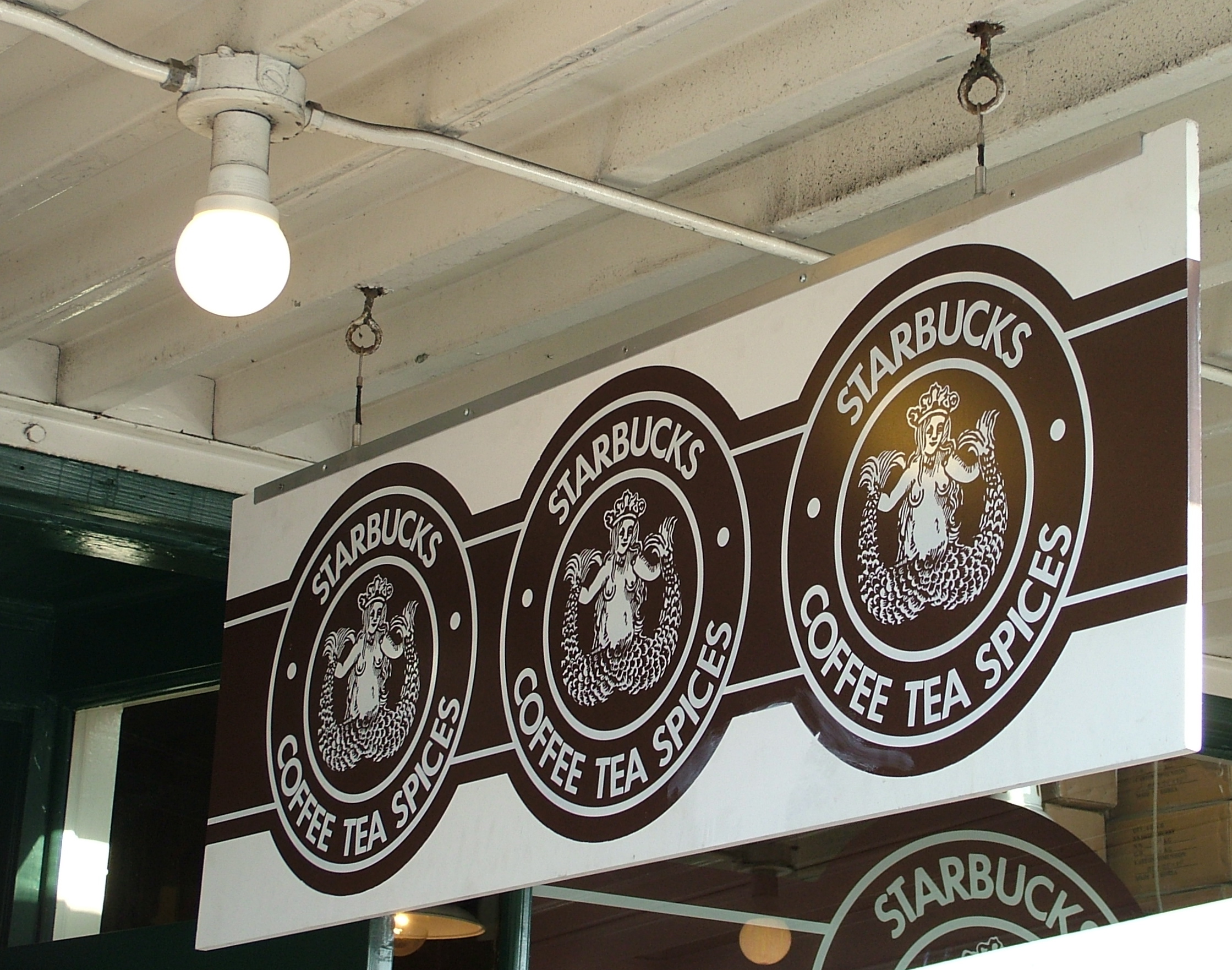
1971
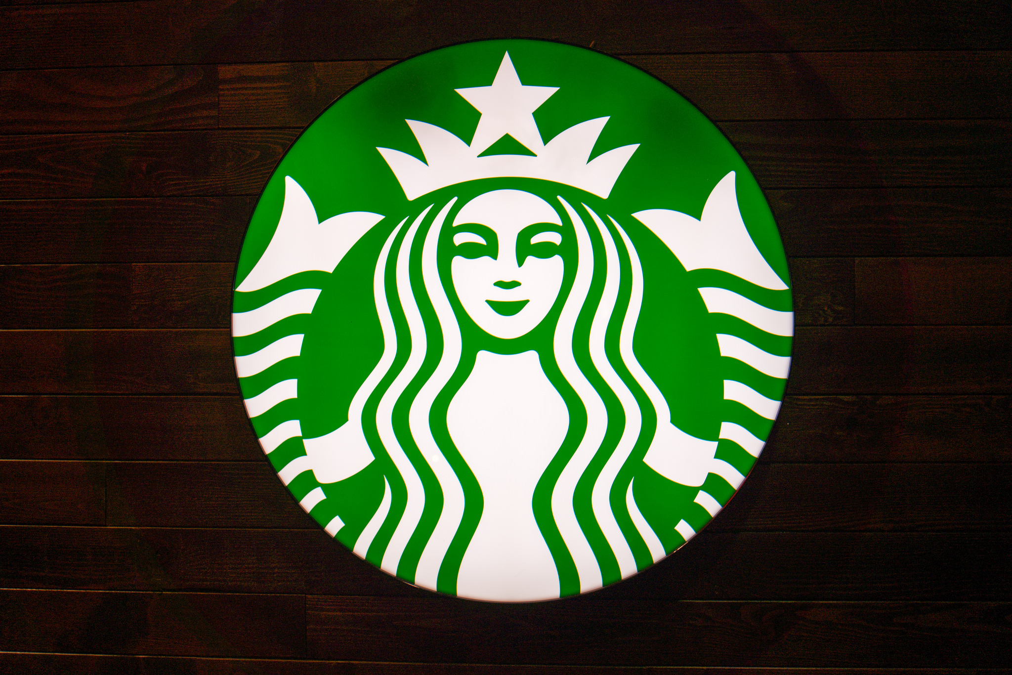
2015
2. Timeless.
Another aspect of making a good logo should be its effectiveness to last through the years. That being said, this does not mean that there should never be changes or updates made to your logo. Times change after all, what was appealing to the people in the 1950’s is not the same as what appeals to people now. When I was first getting into design, I saw numerous blogs with the same idea of timelessness and all the blogs I read had a picture of the Pepsi logo throughout the years next to ONE Coca-Cola logo that supposedly hadn’t changed since 1985. This is simply untrue. Both companies made changes towards simplicity and memorability, which resulted in the effectiveness of their logos throughout the years. The actual chart comparing Coca-Cola and Pepsi can be found here.
3. Functional.
In order for your logo to be functional in any aspect you choose to use it in, then it must be SIMPLE. Yes, that word again. Adding shadow or gradient effects may look great on the background you are working on, but how will it work once moved to a different setting? Your logo should have the ability to swap between white and black backgrounds, be printed on T-shirts or made into stickers with no extra hassle. A functional logo should be one that is capable of being promoted in any which way you choose.
4. Communication.
Your logo should be a representation of your company. However, do not confuse that statement as an invitation to be cliché. Being able to differentiate the two will help you create an effective logo. Lastly, your logo should be marketable not in just one area or targeted audience but everywhere, while still being appropriate.
Understanding the difference between these four things while still being able to incorporate them into your design will be the deciding factor between a good logo and a GREAT logo.
Please note: I reserve the right to delete comments that are offensive or off-topic.